A beginner's guide to UX/UI Design: Crafting user-friendly websites.
In today’s digital landscape, a website is often the first point of contact between a business and its audience. For companies looking to make a strong impression, understanding the basics of UX (User Experience) and UI (User Interface) design is essential. Whether you’re a budding designer or a business owner aiming to enhance your online presence, this beginner-friendly guide will walk you through the fundamentals of UX/UI design. At rockmuse.co, we’re passionate about empowering you to create a website design for company that’s both functional and visually stunning. Let’s dive into the essentials, blending practical tips with insights from my own journey as a designer.
What is UX/UI Design?
Before we get into the nitty-gritty, let’s clarify what UX and UI mean. UX design is all about the experience a user has while interacting with your website. It’s the process of ensuring that navigation is intuitive, tasks are easy to complete, and the overall journey feels satisfying. UI design, meanwhile, focuses on the visual side—think colors, typography, buttons, and layouts. Together, these disciplines create the foundation for effective web design for a company, ensuring your site is both a pleasure to use and a reflection of your brand.
As a beginner, I remember feeling overwhelmed by the scope of design. But here’s the secret I’ve learned: it’s not about perfection from the start—it’s about solving problems for your users. With that in mind, here are eight actionable tips (including my own favorites) to help you craft a website that shines.
Tip 1: Master the Art of Padding
Spacing might seem like a small detail, but it’s a game-changer. Padding—the space between elements—creates a rhythm in your layout, much like beats in a song. Too little padding, and your design feels cramped; too much, and it looks disjointed. For beginners, I recommend starting with generous padding to give your content room to breathe. It’s a simple trick that makes your website feel polished and easy to navigate.
Tip 2: Keep Fonts Consistent and Simple
Typography can make or break your design. Stick to a maximum of two fonts—one for headings, one for body text—and if you’re feeling creative, add a third for subtle accents like buttons or quotes. Consistency here builds a cohesive look and reinforces your brand. Early in my design journey, I fell into the trap of using too many fonts, thinking it would add flair. Instead, it confused users. Find a good pair (like a bold heading font with a clean body font) and stick with it.
Tip 3: Build a Smart Color Palette
Colors aren’t just decoration—they guide emotions and actions. A good color palette starts with a primary hue that reflects your brand, paired with complementary shades for contrast. Make sure text stands out against backgrounds, and use pops of color for links and buttons to catch the eye. I love subtle gradients for depth, but keep them clean—overly bold combos can overwhelm. Play with tools like color wheels to find harmony, and don’t shy away from testing what feels right for your audience.
Tip 4: Embrace Clean, Simple Design
Less is more when you’re starting out. A clean design avoids clutter, letting users focus on what matters—your content and calls to action. Resist the urge to fill every inch of the screen with images or text. My early designs were packed with unnecessary flourishes, but I’ve since learned that whitespace is your ally. It’s like a deep breath for your users, giving them space to process and engage.
Tip 5: Stick to Predictable UX Patterns
Innovation is exciting, but predictability keeps users comfortable. Familiar layouts—like navigation bars at the top or a footer with contact info—are intuitive because people already know how to use them. Straying too far from these norms can leave visitors lost. For your website design for company, balance creativity with usability. Think of it as a friendly guide: you’re leading users, not challenging them to a puzzle.
Tip 6: Prioritize High-Quality Photos
Images are powerful storytelling tools, but quality matters. Grainy or irrelevant photos can cheapen your design, while high-quality photos boost credibility and engagement. Choose visuals that align with your message and feel authentic to your brand. I’ve found that even a single striking image can elevate a page more than a dozen mediocre ones. Invest time in sourcing or creating visuals that pop.
Tip 7: Use Animations with Restraint
Animations can add personality, but too much motion is a distraction. Subtle effects—like a button that glows when hovered over—enhance the experience without overwhelming. I once overdid it with bouncing icons and spinning loaders, only to realize users were annoyed, not impressed. Keep animations purposeful and minimal to maintain focus on your content.
Tip 8: Design Mobile-First
With most web traffic coming from smartphones, a mobile-first approach is non-negotiable. Start by designing for smaller screens, ensuring buttons are tappable and text is readable, then scale up for desktops. This mindset guarantees your site works for everyone. I’ve seen firsthand how skipping this step leads to clunky mobile experiences—don’t let that be your site.
My Take: Design is a Journey
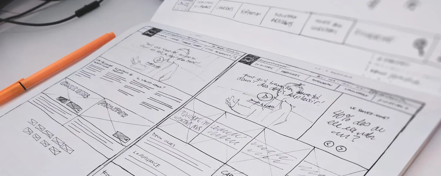
Beyond these tips, here’s something I’ve picked up along the way: design is about empathy. Put yourself in your users’ shoes. What do they need? What frustrates them? Early on, I focused too much on aesthetics and not enough on function. Now, I sketch rough ideas on paper before jumping into tools, letting user needs shape the layout. It’s a habit that’s saved me countless revisions. For your web design for company, think of your website as a conversation. Every element—padding, colors, images—should invite users in and make them feel at home. Test your designs with friends or colleagues to catch blind spots. Feedback is gold when you’re starting out.
Putting It All Together
Creating a user-friendly website doesn’t require years of experience—just a willingness to learn and experiment. These tips—padding for rhythm, consistent fonts, a smart palette, simplicity, predictability, quality images, restrained animations, and a mobile-first mindset—form a solid starting point. They’ve guided me from cluttered chaos to designs I’m proud of, and they’ll do the same for you.
At rockmuse.co, we’re all about helping you build a website design for company that connects with your audience. Whether you’re showcasing a portfolio or launching a business, these principles ensure your site is more than just pretty—it’s effective.
Final Thoughts
Design is an evolving craft. You’ll make mistakes, but each one teaches you something new. Start small, apply these tips, and tweak as you go. Before long, you’ll develop an eye for what works and a knack for creating experiences users love. So, grab your tools—whether it’s a sketchpad or a design app—and start building. Your next great website is waiting.

