The Power of Color in Web Design: Choosing the Perfect Palette for Your Brand
Hey there! If you’ve ever wondered why some websites just feel right the moment you land on them, let me let you in on a little secret: it’s all about the colors. Colors aren’t just pretty decorations—they’re like the silent salespeople of web design, whispering to your emotions, shaping your perceptions, and even nudging you to click that “Buy Now” button. Whether you’re a small business owner hunting for affordable web design services or a creative looking to level up your brand, picking the right colors can make or break your online vibe. So, grab a coffee, and let’s dive into the wild world of color in web design—why it matters, what works for different niches, and how you can nail it for your own project.
Why Colors Are a Big Deal in Web Design
Picture this: you walk into a room painted bright red versus one in soft blue. Feel different, right? That’s the power of color at work. In web design, colors set the mood, guide your eyes, and tell a story about a brand before you even read a word. They can make you trust a site, get excited, or feel totally calm. That’s why nailing your color scheme is a cornerstone of killer web design services. It’s not just about looking good—it’s about connecting with your audience on a gut level.
What Colors Work Best for Specific Niches?
Not every color fits every vibe. Different industries lean on specific hues to match their message and audience. Here’s the lowdown on what works and why:
Health and Wellness
Think soothing blues and greens. Blue screams trust and peace—perfect for a yoga studio or therapy site. Green’s all about health and renewal, which is why brands like Whole Foods rock it. These colors make you feel safe and cared for, which is the whole point in this niche.Entertainment
Here’s where the party starts—bold reds, oranges, and yellows. Red’s got that high-energy, attention-grabbing vibe (looking at you, Netflix), while yellow brings the fun. These colors scream excitement and keep you hooked.Finance
Trust is king here, so blue dominates. PayPal and American Express use it to say, “Hey, your money’s safe with us.” It’s steady, reliable, and no-nonsense—just what you want when dealing with cash.Mood Makers
Black and white are the go-to for that sleek, chic look. Chanel’s nailed this forever—timeless and classy. But some brands, like Gucci, throw in bold greens or reds to flex their luxury roots and stand out.
The takeaway? Match your colors to your niche’s personality and what your audience expects. It’s like dressing your website for the right occasion.
Why Top Brands Pick Their Colors
Ever notice how some brand colors just stick in your head? That’s no accident—big players use color psychology like pros. Check these out:
Coca-Cola: That punchy red? It’s all about energy, passion, and a little “treat yourself” vibe. It’s loud, it’s bold, and it’s been screaming “refreshment” since forever.
Facebook: Blue’s the name of the game here. It’s the color of trust and connection—perfect for a platform that’s all about linking people up. Mark Zuckerberg didn’t just pick it because he’s colorblind (true story); it fits the mission.
Starbucks: Green’s their jam, and it’s genius. It’s fresh, it’s earthy, and it ties into that cozy, quality coffee experience they’re selling. It’s like nature in your cup.
These brands don’t mess around—they pick colors that vibe with their identity and hit their audience right in the feels.
How to Pick the Best Colors for Your Brand or Project
So, how do you choose colors that don’t just look cool but actually work? It’s less about guessing and more about strategy. Here’s how to nail it:
Know Your Crowd: Who’s your audience? Younger folks might dig bright, trendy vibes, while a corporate crew might lean toward muted, professional tones. Age, culture, gender—it all plays a role.
Define Your Brand’s Soul: Are you fun and quirky or serious and luxe? Your colors should scream your personality. A playful brand might go for oranges and pinks; a high-end one might stick to black and gold.
Tap Into Emotions: What do you want people to feel? Calm? Pumped? Trusted? Blue’s your chill pill, red’s your adrenaline shot. Pick colors that match the mood you’re aiming for.
Stay Consistent: Once you’ve got your palette, use it everywhere—logo, site, ads, the works. Consistency builds recognition. Imagine Coca-Cola switching to purple—chaos, right?
Test It Out: Throw your colors on a mockup, show it to some friends, or even your dog (kidding about that last one). Feedback helps tweak things to perfection.
So, how do you choose colors that don’t just look cool but actually work? It’s less about guessing and more about strategy. Here’s how to nail it:
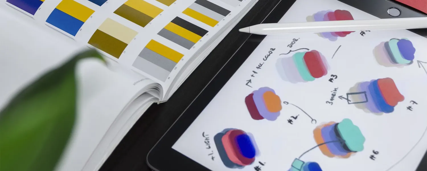
Tools to Create a Pro Color Palette
You don’t need to be an artist to whip up a killer color scheme. These tools have your back:
Adobe Color: This one’s a classic. Play with color wheels, tweak shades, or pull hues from a photo you love. It’s pro-level but easy to use.
Coolors: Need inspiration fast? Hit a button, and this AI-powered gem spits out gorgeous palettes. Lock the colors you like and tweak the rest—it’s like magic.
Canva’s Color Palette Generator: Got a vibe in mind? Upload a pic, and Canva pulls a palette from it. Perfect for keeping your brand on-point and cohesive.
These tools make it stupidly simple to create something that looks like a million bucks, even if you’re just starting out.
Bringing It All Together with Web Design Services
Here’s the thing: picking colors isn’t just a fun side quest—it’s a massive part of web design services. The right palette can turn a meh site into a “whoa” site, drawing people in and keeping them there. And the best part? You don’t need a fat wallet to make it happen. Affordable web design services can hook you up with a pro-looking site that uses color to tell your story, connect with your audience, and boost your brand—all without draining your savings.
Wrapping It Up
Colors are your secret weapon in web design. They’re not just eye candy—they shape how people see you, feel about you, and remember you. Whether you’re picking calming blues for a wellness site, bold reds for entertainment, or trusty greens for a coffee shop vibe, the right colors can set you apart. Use tools like Adobe Color or Coolors to play around, lean on the psychology behind big brands like Coca-Cola and Facebook, and don’t sleep on affordable web design services to tie it all together. Your website’s more than a digital business card—it’s your brand’s heartbeat. So, what colors are you gonna make it pulse with?

